Catching up from the last time we met, just before I went to Analogue. The first call to order was creating a logo we were happy with. From last time, we knew we weren't happy with the original due to it being too old fashioned and dated. I realised we used a wrong logo, so we request a EPS. of the current logo from YCN to work with.
This made the work significantly easier to tackle. So we stripped what we hated, the outlines. This made the logo instantly more approachable, I was amazed it only took that to update it.


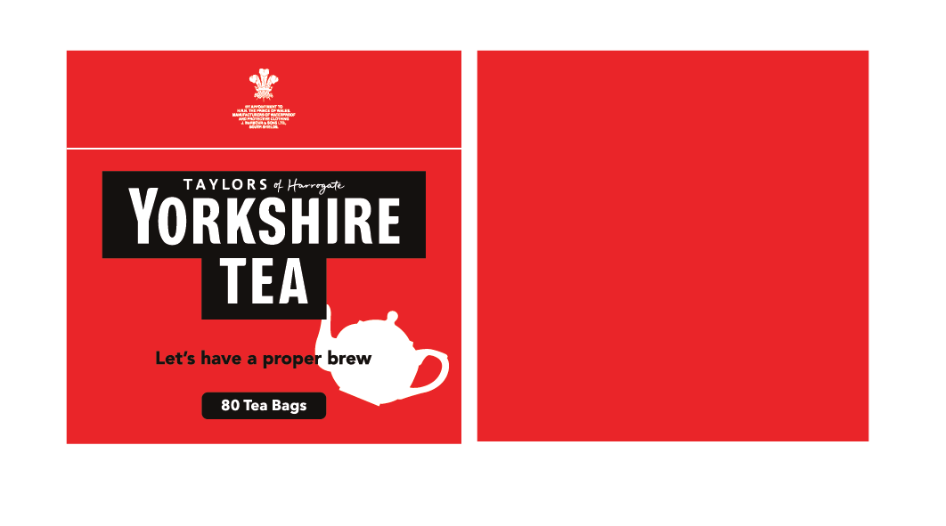
Playing with the separate elements, the logo looks more aesthetically pleasing inside the box when it's singular, I don't dislike the box, now that the outlines have gone. I do however, like the logo without it as well. But, this is the balancing act, we decided to keep it due to how recognisable on it's own, you can tell the brand. Just as type, it becomes any other logo.

I talked to Ant about trying a different route to how we normally would, I wanted to see how simplistic we could take the packaging and how that would work out. Below are some experiments with this concept,


Although It wasn't all the successful, I'm glad we gave it a shot because I don't always like to stick with one idea. It's nice to see how else this could have developed if not for the stronger idea.

No comments:
Post a Comment