I started off by pulling together all the drawn up elements, I didn't want the poster to look too clean and vectored, I just wanted to try something different.


I realised I needed to start introducing the colour into the image to develop it further. This helped take the poster to the next level by stopping it from been so complicated and focusing it. In the process of recolouring, I removed some of the unnecessary items to help tone it down.


Although the poster it's self looked good, I don't think I was truly communicating what Scott Pilgrim was visually enough, and It was all down to colour.
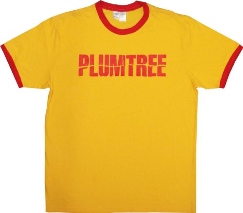
Starting from something that was most iconic within Scott Pilgrim, I took his most famous shirt and made it the colour scheme for the poster. The mustard yellow was incredibly powerful with the red and it instantly turned the poster around to a aesthetic I was really happy with.


Adding in the little details was the finishing touches to the poster, using different tones of yellow to build a hierarchy within the poster to guide the eye to the most important sections such as the time, date and website.


I was really happy with the final poster, It really got across instantly what Scott Pilgrim is all about, strong visuals and a rather nerdy mix of influences: comic books and video games. Although I don't think I'd would have enjoyed this as much as I did, because of my experience with previous poster briefs. I think, if it's a poster with a strong visual component like this, I'll probably enjoy it a lot more.

No comments:
Post a Comment