This post is to inform my self of examples used in Roman display typefaces, what I already know about them from already conceived ideas is that they're Large and very accurately cut. What I'm looking for is something that carries authority, yet is still warm and welcoming, It feels familiar. As also can be read while small which allows it to work also as Body copy.
The photography Grace took around Rome of typography examples yielded some great results, the guide books used in one store used a very accurate replica typeface. However looking at it, it lends it's self to looking like it is literally straight from the Parthenon due to the gimmicky look.


The Parthenon's inscription is too detailed for the look I'm wanting, it needs to be thick,


- Too Rustic looking, come's from the erosion rounding it off.

The Lewis & Cooper sign is perhaps what I'm really looking for. – It has both a sense of establishment about of it as well as authority. Yet you can easily see it been a typeface which would be easy to play with. – (Baskerville/ Georgia may be similar.)


Imperial - Red was often painted into the letters to make them stand out from the white stone. - Or copper was nailed into the letters too.


Yet again similar to the Parthenon, they inscriptions are all very thin, but they work like that when they're inscribed because the bevel gives them depth making them easier to read, when they're bastardised like they do not have the same gravitas.
Inscription from Trajan's column. 113 AD
(Roman Imperial)
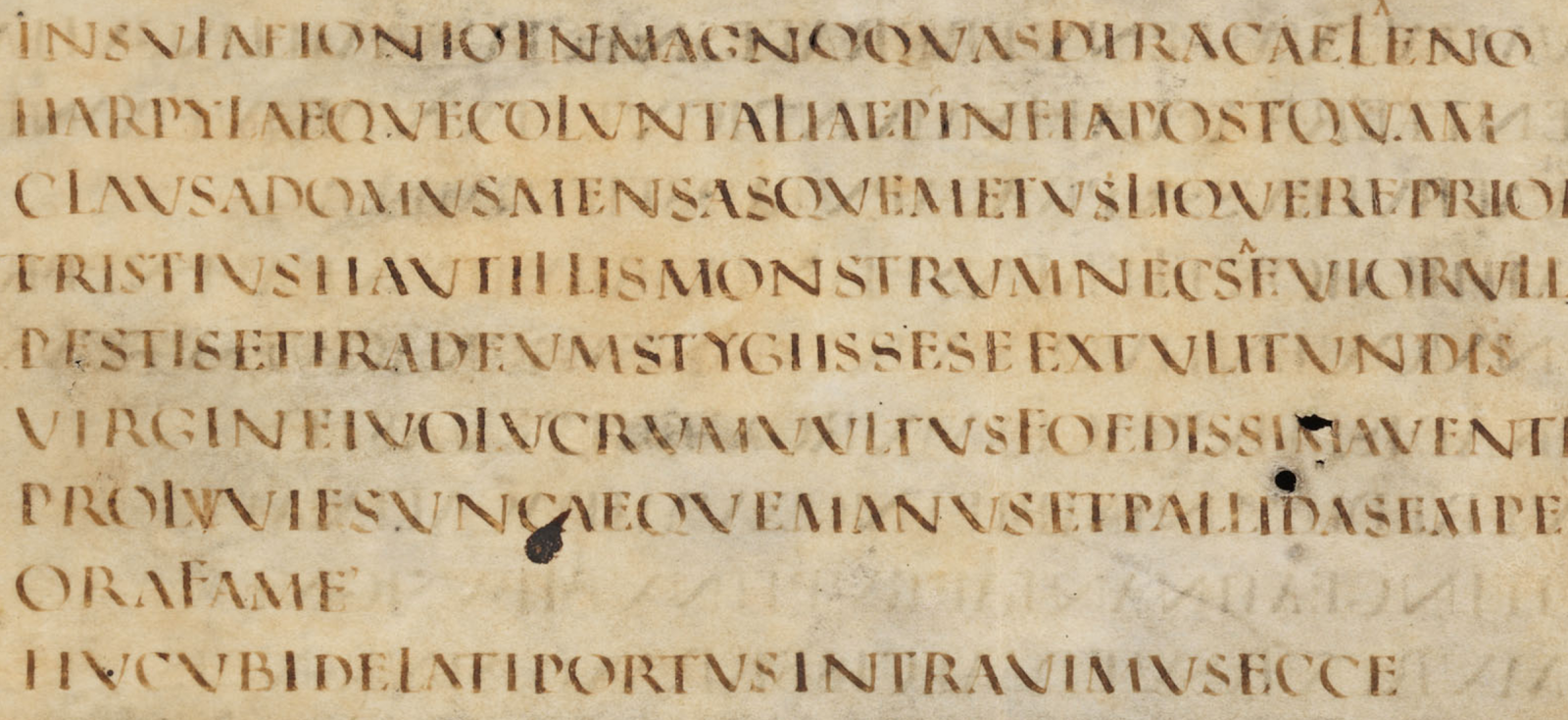
St. Gallen, Stiftsbibliothek 1394.
(Roman Capitals)
I think a very suitable match for a merge of both Capital and imperial is perhaps Baskerville, (Not times new roman however it's too sterile.) This is probably the closest counterpart I can find currently. Old versions of Palatino exist from the renaissance which look like they would work also.
Finding a merge of the new and old might be possibly the answer.


No comments:
Post a Comment